The Forest re:Framed
The Forest re:Framed is a series of photography-based installations providing multi-scale, immersive forest experiences.
Scientific research has shown that forests are complex, inter-related systems, communicating by means of bio-chemical networks and expressing attributes such as cooperation, protection, and memory. The therapeutic and spiritual nature of forests has been contemplated for centuries. My own curiosity about the visible and invisible attributes of forests manifests as visual studies integrating three dimensional representations, projections, and abstractions.
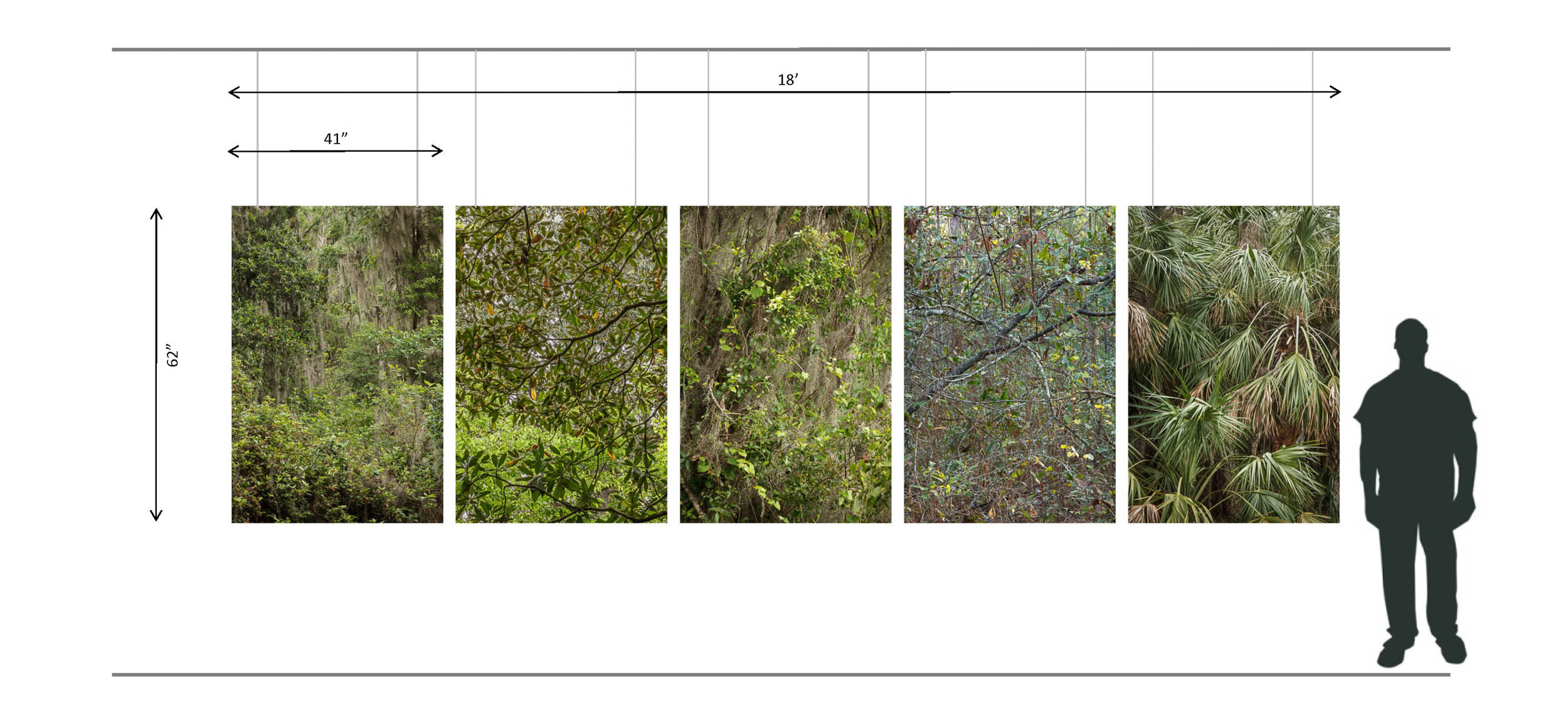
My goal is to express the timeless expanse of a forest experience beyond a single tree to gain insight into these critical systems. Photography at public forest lands and production of “long” photographs (stitched panoramas) establishes the raw data. “Reframing” the composite image using layering, positioning, and overlap techniques allows multiple interpretations. Included are sliding panels, multi-depth backgrounds, hanging drapes, backlit panels, and laminated prints up to 14’ long. Departure from the traditional framed print provides multiple points of access to these landscapes.
The scope of the ongoing project includes detailed study of a local forest, regional study of Southeastern forests, and an inquiry into old-growth vs. managed forests. The project incorporates my other studies including Decoding the Infinite Forest and Landscape of Density. Portraying a complex system and its many symbolic and metaphorical relationships to our culture is the desired outcome.
First exhibition, September 2018 - Slow Exposures, Zebulon GA at the Split Oak Barn
3D Elements
I began to introduce 3D elements by including a set of branches in a series of 4 square pieces arranged to be offset from the wall. Each piece is 20x20 and sits 5” from the wall. The branch piece sits flush to the photographs.
Dimensional Study 1, 2017
The concept was further developed for the commission “Connected Stillness” for the Baptist Medical Center Weaver Tower, main lobby. The site contained 4 alcoves that I filled with natural branches enclosed in acrylic boxes. Everything sat flush to the surface of the prints to create an uninterrupted plane. Here is the post for the installation.
Connected Stillness - Weaver Tower, 2016
Panoramas
Long panoramas allow the viewer to experience the linear progression of an image by first taking in the overall scene and then closely inspecting the detail while moving along the viewing axis. The first long print, Tactile Wilderness was an experiment for mounting technique and viewer response.
Tactile Wilderness - 156x20 print laminated to aluminum flashing, 2013
MOSH Exhibit, 2017
Non-planar mounts
A non-planar mount shifts selected portions of the image in and out of plane to accentuate the dimensionality of the original scene. The integrity of the image is preserved when viewed perpendicular to the plane.
Color of Morning - laminated inkjet prints on Sintra, 2017
Folded Prints
A folded print is a single contiguous sheet of paper cut and folded into multiple planes created by equal and unequal parallel fold pop-up techniques. “Folded Forest” started as a panoramic print that I wanted to mount on a wall corner having two turns. Within the turns I introduce pop-up folds, further accentuating the multi-layered aspects of the forest, which are rendered flat on a conventional print. By forcing the eye to connect the planes to resolve the separations, we experience some of the forest details that are typically overlooked.
Folded Forest - construction plan, 183x23 paper, 2017
Collage City - 24x48x24 x96H paper on plywood, 2011
Collage City was part of the Pop-Up Gallery project initiated by Dolf James in Main Street Park (2011). The “S” shaped base structure is similar to Folded Forest, and contained a series of pop-up folds. This design was implemented in plywood and made into a free-standing sculpture, then images were applied to the surfaces, one side representing nature, the other buildings. This was one of my first experiments with dimensional surfaces for print images.
Sliding panels
Viewer engagement was the primary goal by providing an interactive display inviting viewers to touch, move, and reconfigure the photograph to explore the details and create their own configurations. Usually artwork is off-limits to touching and fixed in the presentation of the visual narrative. By providing sliding panels, one is encouraged to move the image fragment, to see what is underneath and to match the break in continuity. Discovery of detail is encouraged through interaction and solving the “puzzle.”
Storm’s Reprisal - full image 209x20
Reprisal - inkjet prints mounted to foamcore, custom sliding rail enclosure, 2017
Reprisal - studio installation
Translucent drapes
When printing the murals for our One Spark project, our supplier ran out of the desired banner material (11 Mil Blockout Water-Resistant Polypropylene) and substituted a translucent material (Poly Select Heavy). We were concerned that the see-through properties would be a problem for the murals. With an abundance of left-over material I started using it for hanging banner-like installations. The media was durable and made beautiful prints. After hanging a few prints in my studio someone brought over a light which was left on in the back of the installation. The print illuminated like a backlit panel! I was so excited about this discovery as it avoided the issues with building lightboxes and securing a backlit print. The forest scene below was created and lit with several floodlights from behind. We also shifted the individual planes to create the dimensionality of a forest.
Enlightened Forest - inkjet prints on polyester fabric, backlit
Enlightened Forest - installation at Slow Exposures 2018, installation at Cork Studios 2017
Hanging Murals
A hanging mural provides an accessible method to display large prints without expensive mounting considerations. The media used is Lexjet Poly Select Heavy, a 230 g/m² 13 mil, bright-white polyester fabric compatible with pigment inkjet printers. Each print is sprayed with a satin acrylic coating for UV protection. Standard banner hanging hardware is used for mounting.
Landscape of Density - hanging murals, installation at Slow Exposures 2018
Layered Composites
We have used the concept of “layers” in Photoshop for years, but I have always wanted to do an analog version of layering. Experimenting with various transparent media, I learned that the presence of “white” in the substrate of the print provides a critical component of the color and contrast of what the viewer sees. Without this component, the resulting composite looks washed out and lifeless. Backlighting the assembly of layered prints helps to bring out detail, but it still remains elusive on what combination of techniques can effectively produce a successful “layered” print.
I began with a series of 3 images called “Fog in the Key of Tree,” which were all taken one morning at Cary State Forest in different locations. Each image had a different ratio of visible trees to background. As the morning progressed the fog receded and the trees became more visible. I wanted to combine these images into a composite that reflected my impressions of the forest that morning, the mystery of the fog shrouded trees and the revealing of detail as the fog lifted. It’s difficult to see the final result in the image of the completed piece, but i was happy with the direction of the experiment.
Fog in the Key of Tree - original images, 2016
Layered Composite - experimentation with various print media, opacity, lighting
Completed mockup on LED light fixture, 3 layers on 3/16” acrylic - 30% opacity B&W on DisplayTrans, color on HP clear film laminated to acrylic, 2017
Dimensional Photographs
I started mounting photographs in a “dimensional” way by salon-style arrangements with varied spacing off the wall. This is similar to a “non-planar” mount explained above, but flatter, and achieved by using stand-offs and blocking, raising the mount above the surface of the wall and perhaps overlapping adjacent prints.
Healing Nature - Baptist South Emergency Lobby, 2011
I began to apply these principles to an individual image, preserving the integrity of the image but extracting sections and re-formulating the print method (B&W, face-mount acrylic, clear-mount, solid color) and moving these sections out of plane. One of these ideas was incorporated into a piece at the MD Anderson Cancer Center.
“Dimensional” photographs, 2018


