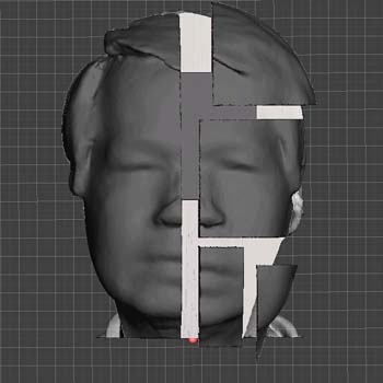
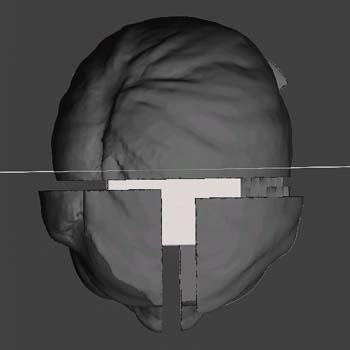
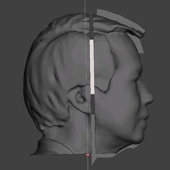
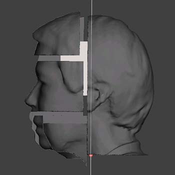
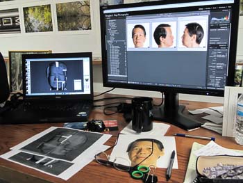
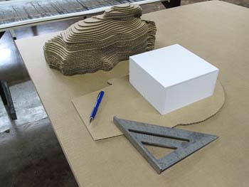
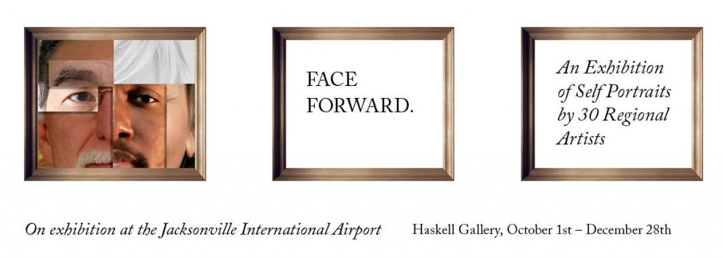
 In March I received an invitation to participate in a group show, Face Forward, sponsored by the Jacksonville International Airport Arts Commission. The rules were simple, produce a self-portrait on a provided wooden panel, 24" x 24" x 2", any medium. Self-portrait? I don't do those. Asking around, I found that there were 30 artists asked to participate, most were heavy hitters...painters, sculptors, you know, "real" artists! I really wanted to do something more than photograph myself and paste it on a board. I thought this would be a perfect time to try something on the CNC router table sitting in the corner of my studio.
Unfortunately my schedule had been completely unreasonable since the Streaming South exhibit, with outside work, printing, and commercial commissions. So the time to experiment and "play" would be limited. With the deadline rapidly approaching I committed by writing up my submission proposal and dove in. My initial design called for a "decomposition" of the 3D contour map of my head revealing an actual photographic self-portrait within.


Here's a summary of the tools/software used to produce the piece:
- 3D scan using the Structure Sensor on iPad Air
- Skanect to generate mesh from scan data points
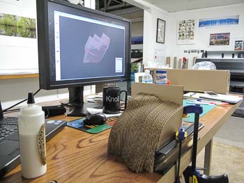
- Meshmixer to repair ear and simplify mesh
- Netfab Basic 6.3 to divide model into main pieces and carve out cube in middle of head
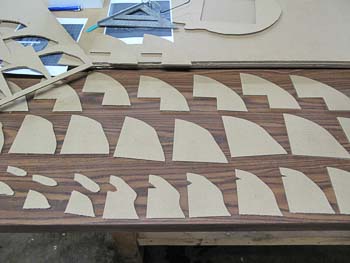
- Meshmixer to take each part and generate slices
- VCarve Pro to layout pieces and generate toolpaths for each slice using the Donek dragknife gadget
- Mach3 to generate P-codes for CNC
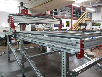
Believe me when I say this is not for the faint of heart, be prepared to do some digging and hacking into this workflow. It is not well defined into a nice easy to follow package. Once you have a working knowledge of the software, you must get your CNC working. Luckily I was cutting corrugated cardboard with a dragknife (utility blade) so I wasn't producing a huge mess of dust. I got through this project with 12 hour days for about 2.5 weeks. The final assembly and gluing the parts together was the most fun, but I could see where I needed to improve technique for future models.


On 9/10 I finally delivered my finished piece and on 9/24 the exhibit had a one night showing at the CoRK East Gallery followed by the installation at the Haskell Gallery in the Jacksonville International Airport.
In retrospect I felt I really went out on a limb on this one. It had a very high chance of failure and resulted in some extremely frustrating moments when nothing was working. I believe the process of producing art is difficult, and when it becomes easy and safe and predictable, we lose the magic of the breakthrough and/or discovery. We are built to be curious and to venture into the unknown. I'm glad I did.
"When you do something that is guarenteed to succeed, you are basically closing the possibility for discovery." - Milton Glaser

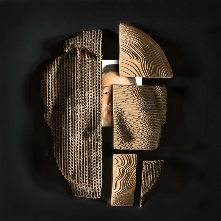
Replicated Self
Mixed Media – Corrugated cardboard, pigment print
Self-portraits are typically well-defined for each medium. The ubiquitous “selfie” is made popular by the availability of cell phone cameras and elevates the self-portrait to an essential component of identity. “Replicated Self” is an experiment using a 3D selfie rendered to 3D forms. Using readily available tools and software, the captured 3D data provides a departure point for my first basic inquiry – deriving a “contour map” of my head and reconstructing the map in 3D using a CNC router table cutting corrugated cardboard. From here I begin a decomposition revealing my current state of discovery and curiosity about the process.









 In March I received an invitation to participate in a group show, Face Forward, sponsored by the Jacksonville International Airport Arts Commission. The rules were simple, produce a self-portrait on a provided wooden panel, 24" x 24" x 2", any medium. Self-portrait? I don't do those. Asking around, I found that there were 30 artists asked to participate, most were heavy hitters...painters, sculptors, you know, "real" artists! I really wanted to do something more than photograph myself and paste it on a board. I thought this would be a perfect time to try something on the CNC router table sitting in the corner of my studio.