Project Archive

December Arbus cover

Cover_Dec2011_Arbus.jpg

I was thrilled to have my amaryllis photo on the Arbus December cover. These photos were from a dining room table shoot on January 1 of this year.

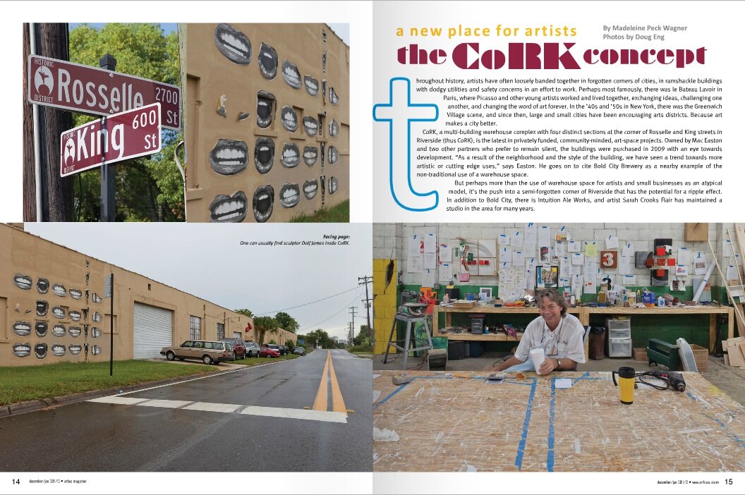
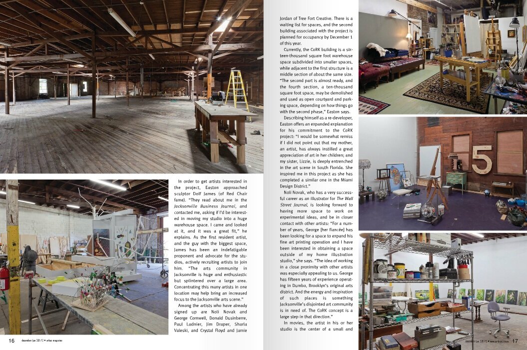
The issue also contained 3 other stories about projects I'm involved in: Message in a Bottle (page 12) , CoRK (page 14), and the Pop-up Galleries at Main Street Park (page 20). Many thanks to Cinda Sherman at Arbus for her dedicated support of the arts in Jacksonville.

Arbus Dec Cork 1.jpg
Arbus Dec Cork 2.jpg
Shout out for Message in a Bottle

Shout out for Message in a Bottle

Arbus Dec Pop-up 2.jpg
Arbus Dec Pop-up 3.jpg

IPA Awards - 2011

My last submission of Straight and Twisted to the IPA won an Honorable Mention in the Professional Category - Trees. I remember agonizing over what category to use, Professional or Non-professional. I figured I'm a professional now so I went for it. This is a huge competition with hundreds of awards, so I'm careful not to be too excited about this, but it's good for the ego to be selected once in a while. I have my share of rejections for sure! The exercise of submitting and keeping your work in a form where you can efficiently submit is a good practice. I'll do 3-4 submissions a year if I feel my work fits well in the call. IPA is great in that there are categories for everything, and you can spend a fair amount of time looking at some great photography from previous winners.

IPA_award2011.jpg

IPA Awards

Last year I entered several images for the International Photography Awards and just discovered (quite by accident) that I won an Honorable Mention - Cityscapes for my City Views Submission. I guess they never formally announced any winners, so when I went to submit again for 2011 I started browsing the last year's winners and found my work. What a surprise! I think I'll print myself a little certificate that I can hang on the wall. I find myself entering a lot of these competitions and forgetting about them...bad habit. Is going through the exercise of submission and the paying fees worth it? I think by being selective, one can hone your skills of efficiently submitting work, which is something you need to do when applying for grants and proposals. This has to be in order, or you'll spend an inordinate amount of time responding to these requests. Have your resume, artist statements, bio, and lo-res image portfolios well organized and handy. I've spent days working on a proposal...felt a lot like doing your taxes! Get your stuff organized and make it easy for yourself. And you may get an award to post on your resume!

ipa_award2010.jpg

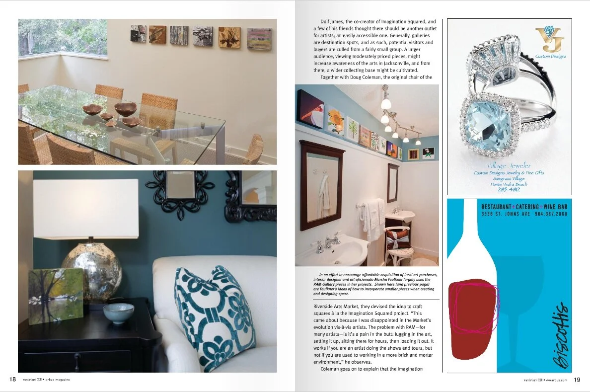
RAM Art Gallery featured in Arbus

The March/April issue of Arbus Magazine features an article about the RAM Art Gallery with some great photographs :). I shot these late last year and was wondering when/if a story was going to run. The idea was to show how the RAM Art Squares could be used to decorate various rooms. Marsha Faulkner, ASID, arranged to have us install and photograph the squares at 4 different locations, so we spent the day carting a few bags of squares all over town. We had a blast. What a wonderful spread and a good read about this important project. If you haven't visited the Riverside Arts Market you need to do so. It is quite a phenomena, growing from an idea by Wayne Wood to one of the most widely attended events in town. Catch it every Saturday (except in the dead of winter) under the Fuller Warren I-95 Bridge in Riverside (north bank). Food, music, street entertainment and lots of art for sale.

arbus3_p1.JPG
arbus3_p2.JPG

This is a Cool Place

Dolf James is always coming up with something new and creative to get people involved with the arts in Jacksonville. His latest project, Art In Strange Places,  includes bumper stickers that are placed all over town announcing that Jacksonville is a cool place. How cool is that? Coinciding with this is Dolf's new installation at MOCA (chair related of course), and as a teaser to all of us wondering what the heck is going on, Dolf made 3 Red Chairs and is taking these all over town for pics. I went out with Dolf on New Year's Eve and we had a blast...driving around town and finding some cool spots. We met a few new friends on the People Mover and it suddenly occurred to me what a neat way this is to meet people . I mean it is much cheaper than having a puppy! When you carry around a big red chair people notice, they inquire, and ultimately they want to sit in your chair! Bingo.  

CoolPlace.JPG
3 Red Chairs have their day in court

3 Red Chairs have their day in court

Hey, follow that chair!

Hey, follow that chair!

3 Red Chairs enjoying the fountain

3 Red Chairs enjoying the fountain

Follow the expoits and adventures of the 3 Red Chairs on Facebook.

Help Portrait 2010

helpportrait.jpg

On Saturday we did another session at Family Promise Jacksonville and met with 6 wonderful families for some holiday portraits. Help Portrait is a voluntary initiative started by Nashville photographer Jeremy Cowart. Last year over 40,000 portraits were taken by over 8,300 photographers worldwide, all for the joy of giving, not taking, pictures. It is always a great pleasure to meet with families and young kids at this time of the year and to share some holiday cheer through photographs. I know after all the packages are open and the season wears off, those photos will continue to bring joy and memories to their owners. What a privilege it is to give this kind of gift. My sincere thanks and best wishes go out to Razzle, Devon, Emery, Latoya, Yakema, Malaki, Tykia, Zyasia, Ronnie, William, Tameika, Shon, Jayniha, Elijah, Ruby, Aleta, Yehudit, Justice, Stacy, Makenna, Sasia, Triniti, saul, Frank, and Jesse. And to Mark of Family Promise. You were all wonderful today!

Family Promise families

Family Promise families

Art Squared at Southlight Gallery

Doug Eng and Dolf James, Art Squared at Southlight

Doug Eng and Dolf James, Art Squared at Southlight

Me

Me

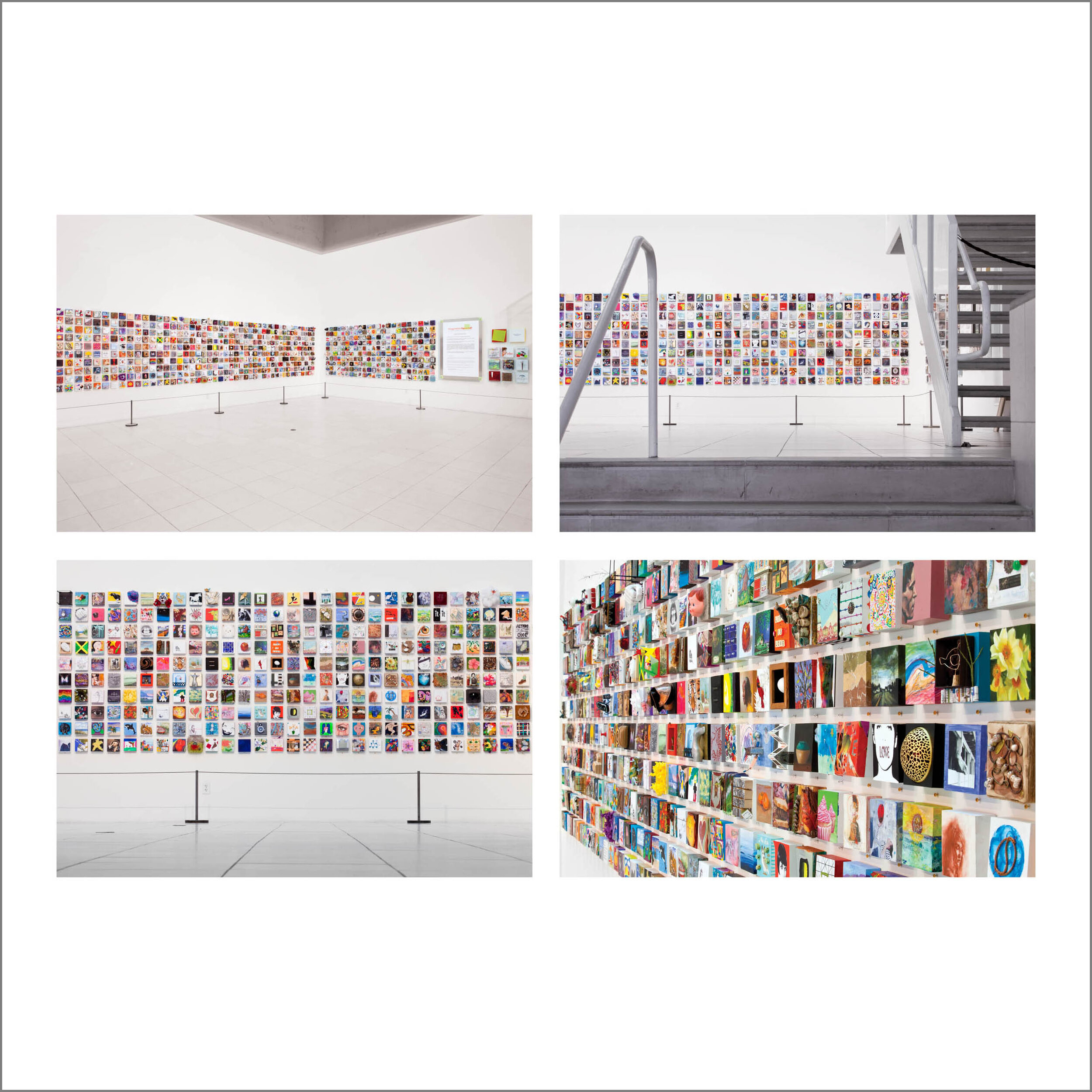
A new body of work is now installed at Southlight Gallery titled Art Squared: Imagination Squared! Photographs. It is a collection of my favorite images from the Imagination Squared project, those which coveyed the uniqueness and simplicity of the exhibit. Many of these were featured in the article Art Squared in the Nov/Dec issue of Arbus Magazine. There are a lot of fond memories in these photographs and that's why they are so important to me. Working on this project was the turning point in my "art" career and I am thankful to have been a part of it. Find a project where you can work with others to help all reach a common goal. That's how amazing things can get accomplished.

Each of these were printed as a square 20x20 on Epson Ultra Premium Luster and sandwiched between a sheet of foamcore and plexi. I used Uni-frames to put everything together, and ended up with 12 pieces. If you need a source for acrylic sheets in Jacksonville call Red at Farco Plastics off Phillips Hiway (near 9A). A 48x96 - 1/8 in sheet costs about $60 (they will also cut to your spec for free). Overall I was pleased with the installation, it looked decent without costing an arm and leg. It's always important that your work be presented in a professional way, or your viewer will not take it seriously.

Art Squared poster, 13x19 archival print

Art Squared poster, 13x19 archival print

These photographs are available in many sizes, including 8x8 and 12x12 folios of all the prints. I also have a 13x19 mini-poster for this exhibit, and these are $15. Email me if you are interested in prints, the mini-poster or any of the other Imagination Squared exhibition posters and prints.

Art Squared in Arbus Magazine

Today the Nov/Dec issue of Arbus Magazine was released with a six page spread of my photographs from the Imagination Squared exhibit. I'm a little bit blown away. It seems like such a long time ago when we were all consumed with this incredible collaborative art project. When all your creative energies are focused with like-minded people, things just happen. Wow, sorta like running a marathon for the first time, and then you ask, "what's next?" I have some loose ends to tie up on the project and my goal is to write a short book documenting the process and key events. I don't want the genius of what happened to be lost. We are a society hungry for the next big thing, and the past big things can easily vanish. The inspiration of Imagination Squared for other cities and artist groups needs preservation and dissemination. I hope to be a part of that too.

Arbus_CvrNov2010sm.jpg

I would like to thank Cinda Sherman the publisher and CEO of Arbus Magazine. She approached me soon after the exhibit with the idea of a photo essay of my best images and just left it at that.  Cinda is a visionary who "gets it" for the city and the arts community. From her tireless efforts comes a remarkable, high quality publication that supports and promotes the arts in our city. Arbus is distributed for free and paid through advertisers, a tough business model to negotiate. Bravo to Cinda and all the advertisers in Arbus.

You can experience the photographs in the Arbus spread at an exhibition in the Southlight Gallery on Forsyth and Laura. I'll be ready with everything on November 3 the night of Art Walk. Drop by to see these and some other memorable moments, and then head on down to MOCA to view the exhibit which comes down on November 14. Hope to see you soon!

The hi-res version of the article can be viewed at the Arbus website here.

arbus_p1.JPG
arbus_p2.JPG
arbus_p3.JPG

What if you gave a party and 4000 people showed up?

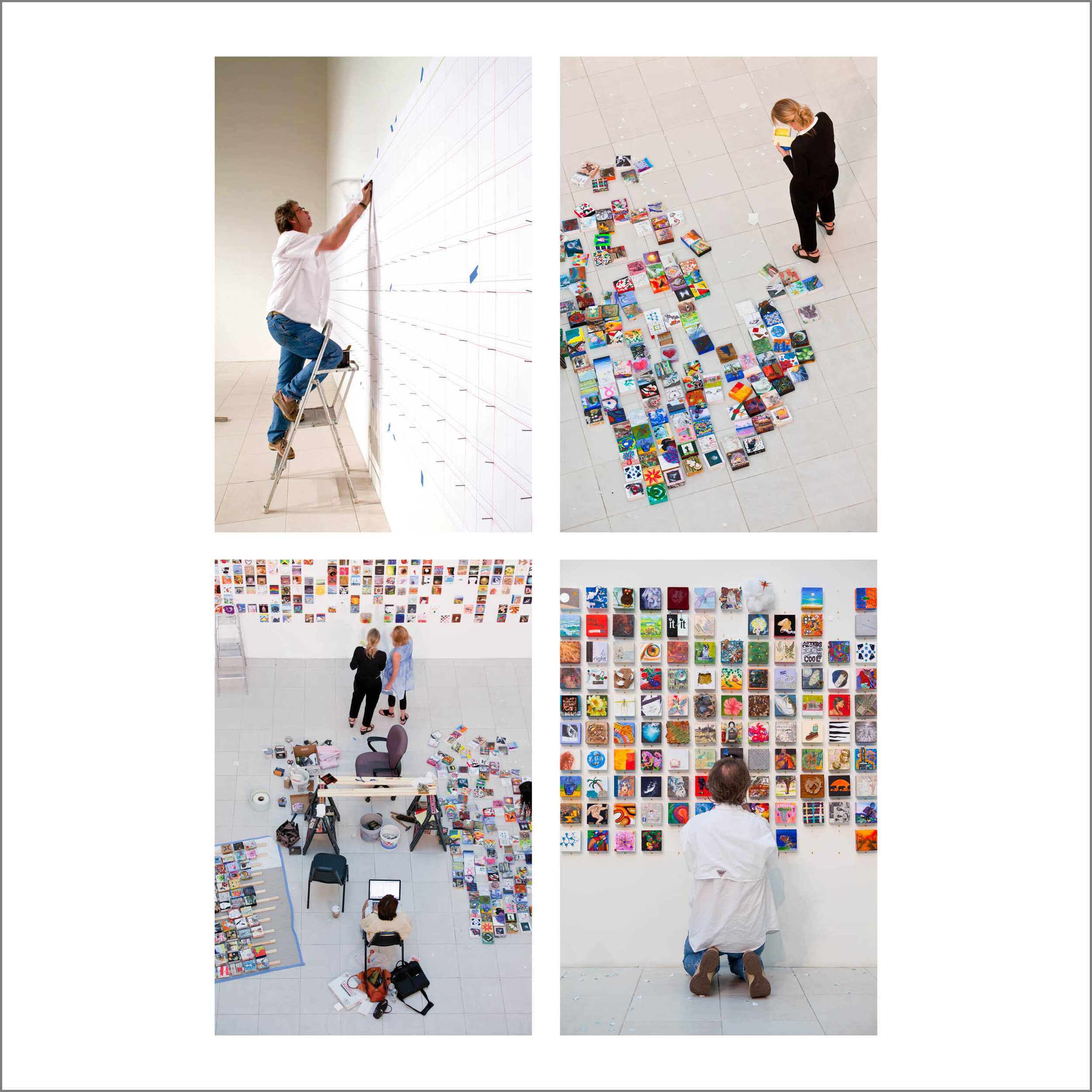
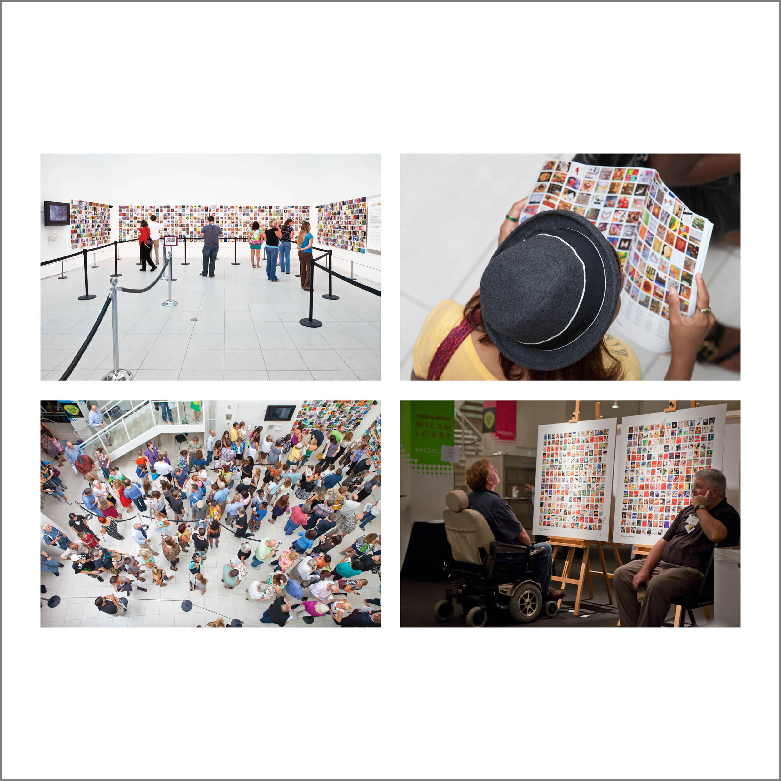
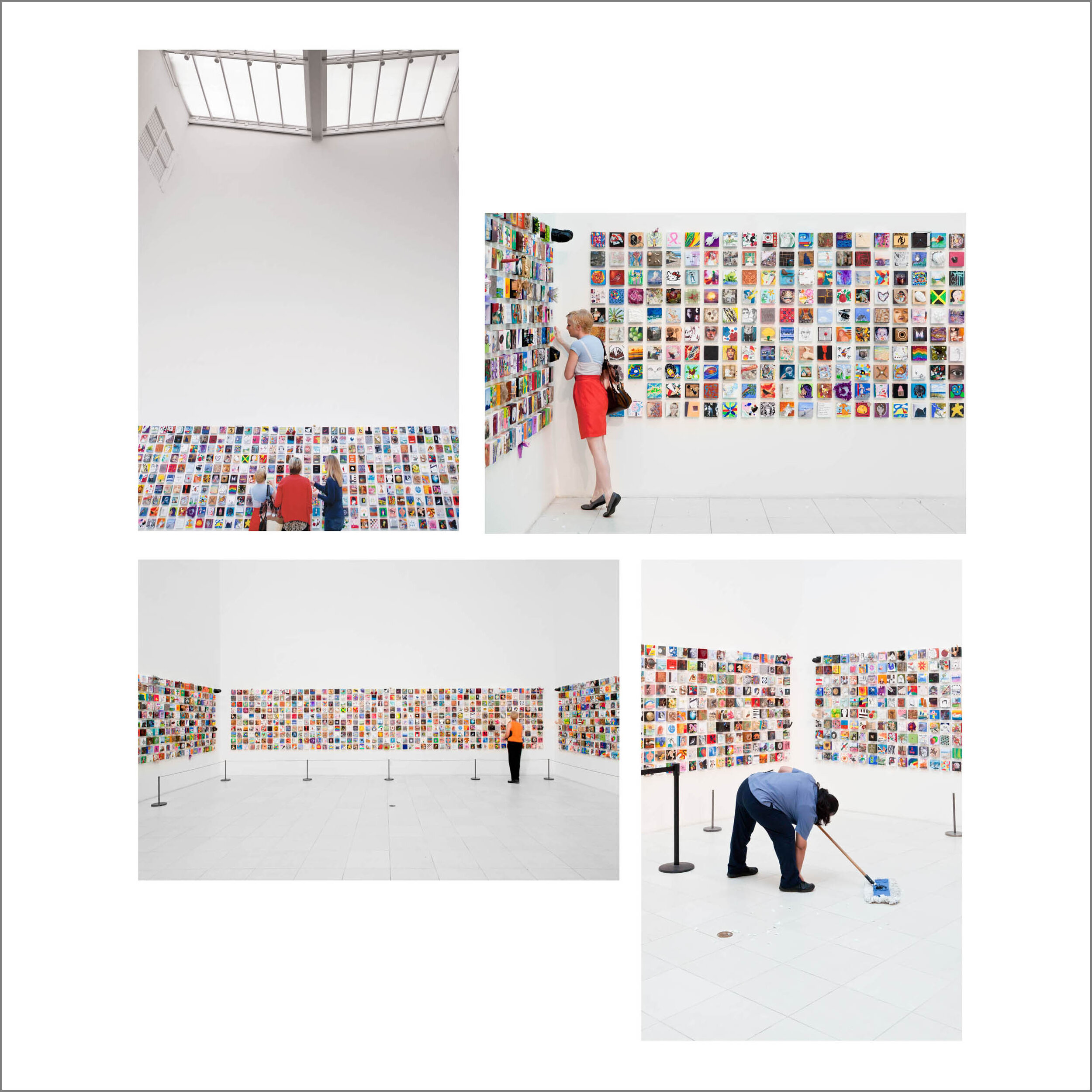
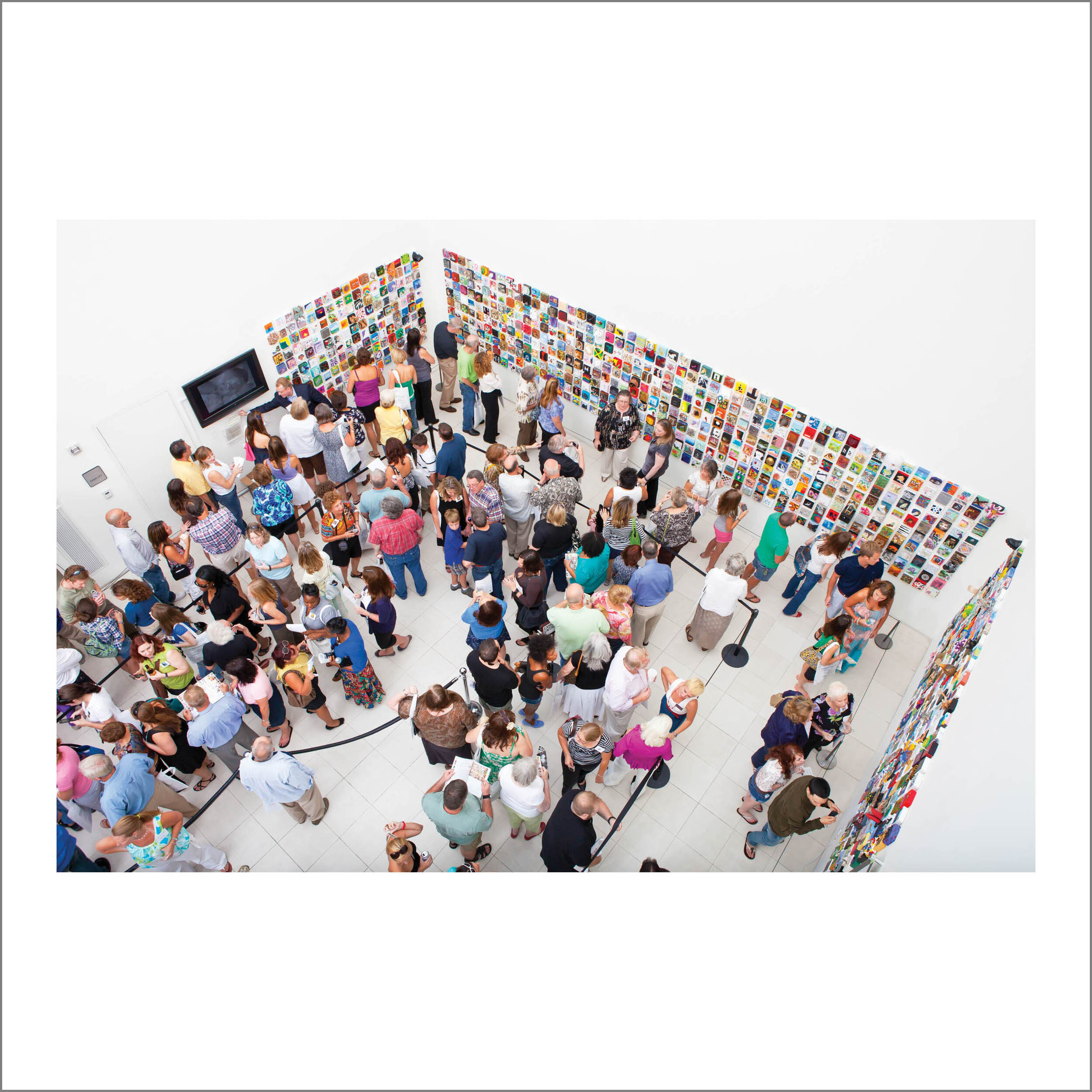
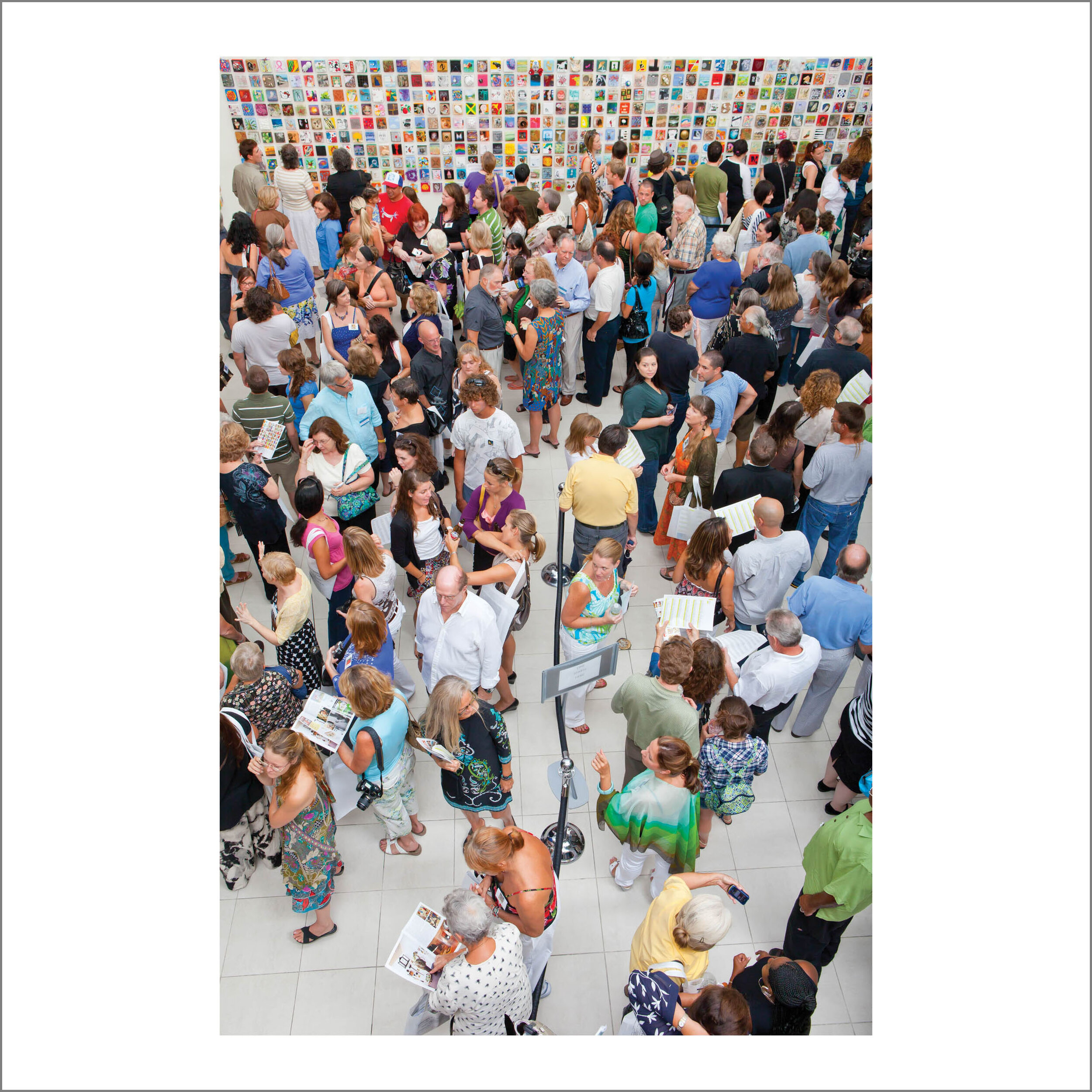
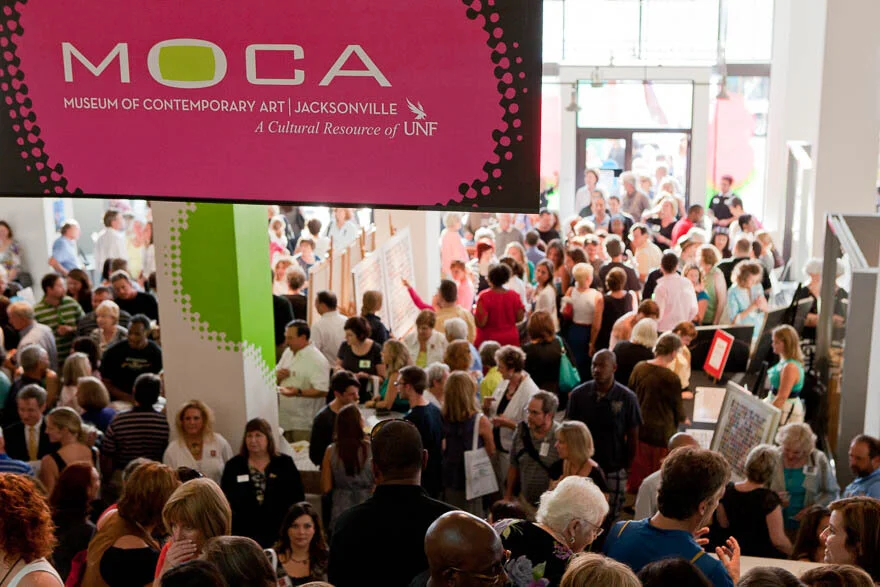
Last night Imagination Squared! was unveiled to a crowd of almost 4000 at the Museum of Contemporary Art (MOCA) in Jacksonville. A culmination of 6 months work, and the participation of 910 artists (and would-be artists) from all around Jacksonville. It is perhaps the most significant cultural event to date in Jacksonville and demonstrates the creativity of two artists, the support of a core group of volunteers, and the response of a city hungry for the joy that art can provide. I am quite speechless about the turnout, and the overwhelming accolades from everyone who attended. I'm proud to say that I found myself in the middle of things towards the end of the project, when things started getting interesting. I guess the engineer in me just wanted a challenge. Congratulations to Dolf, Christina, and all the artists in Jacksonville for a job well done. And thanks to all who support the arts in Jacksonville. More details and stories to follow...

IS_Moca_D5_2010-0901_002.jpg
IS_Moca_D5_2010-0901_080.jpg
IS_Moca_D5_2010-0901_108.jpg

Of This Earth

Of This Earth exhibition at Southlight GalleryHere is my new body of work hanging at Southlight Gallery. This is just one group of images from our trip to Yellowstone in late May, (sorry, still working on the post). In going through all my Yellowstone pictures, I found several groups of images that were candidates for a submission. My past two exhibits have been on trees, and I had plenty of tree images to choose from, but I wanted to try something different. I enjoy showing images of things that are unique and thought provoking, so what could be more interesting that a look at details around a hot spring? (we don't have many of these here in FL).   After selecting the final images, I found that all of them came from two areas, Grand Prismatic Spring in the Midway Geyser Basin, and the Canary Spring/Minerva Terrace in Mammoth Hot Springs. Both areas were quite magical and extraordinary.

 Grand Prismatic Spring

Canary Spring     Minerva Terrace

Here is my artist statement and images for the showing:

There is no place on earth like Yellowstone National park. And here you can find the largest number of geysers, hot springs, fumaroles, and mud volcanoes anywhere. These openings in the ground create other-worldly landscapes and details from a mixture of water, steam, minerals, chemicals, and the attraction of a myriad assortment of bacteria and small organisms. The patterns and textures are living, dynamic structures, changing constantly over time.

For many the beauty of Yellowstone is usually found in its wildlife, flowers, lakes, and landscapes. For me there is greater interest in what is different and unique. My fascination with these thermal features draws me into a primitive world of ages ago, when the earth was cooling, and the basic elements of the earth began to support life. Isn’t it interesting that these areas support only primitive life forms (bacteria, algae, fungi) and are hostile to others? Portraying landscapes and details emphasizing the fundamental flow patterns reveal the beauty in the structure of natural things. We seek order in our observations…nature provides it if we know where to look.

Overflow - Grand Prismatic Spring

Boundary - Grand Prismatic Spring  Mountains & Valleys - Grand Prismatic Spring  Seismic 1  - Grand Prismatic Spring

Foiled - Canary Spring  Slice - Grand Prismatic Spring  Lace - Canary Spring

Friction - Canary Spring  Lace - Minerva Terrace  Seismic 2 - Grand Prismatic Spring

You'll have to drop by the gallery to see the bigger versions. The best comment from the opening was someone who asked if I was in an airplane when I took these...love it! The work should be up for at least 2 months.

AIA Cover shot

The cover of the Spring 2010 issue of Florida/Caribbean Architect Magazine features a project I did for Powell Design Group in February of 2009 (see my Trapac post). I'm so excited about this, and give credit to the architect (and my good friend) Albert Rodriguez, AIA who created some really innovative designs for a series of buildings at the Trapac container distribution facility. The cover features a detail of the Administration Building, one of 14 uniquely designed structures for managing, inspecting, maintaining, and warehousing containers. This facility can be seen on the northwest end of the Dames Point Bridge. The article inside features some additional images and I can't wait to see it! Congratulations Al and Joanna on being published and thank you for getting me involved in your project. A PDF of the article: Florida Architect, Spring 2010 Article 

AIA_coverAIA_cover2

Faulkner Residence

Faulkner HouseNestled in the Mandarin woods on Brady Road sits a remarkable house. I remember during construction wondering what would eventually evolve. I tire of the cookie cutter builder's homes covering our neighborhood (in fact I live in one). I knew there was going to be something different about this structure. The home's architect, Jason Faulkner is also a builder, craftsman, and mechanic. A graduate of the University of Florida, he decided that he needed a place to work on his cars (he races a vintage Porsche) so the house and workshop was born out of that necessity. Finding a corner lot with open access allowed him to build his ideal living and play space. Unsatisfied with the workmanship of the initial contractor, he took upon himself to hand build 80% of the house. The house contains standard building materials, all things you can buy at Home Depot, plus a few commercial windows and found objects. Jason's wife Marsha, an interior designer, applied her talents to the inside of the house. The result? Something I find unique and playful, functional and visually stimulating. What I particularly enjoy are the attention to details, use of materials, and the open spaces. Oh yes and the workshop, every guy's dream garage with plenty of space for cars and car stuff. Jason and Marsha have recently launched their own practices. Can't wait to see the types of projects that will emerge from their studios.

 Faulkner House, East elevation  Faulkner House, West elevation

Faulkner House interior 1  Faulkner House interior 2


Group shots using composites

Turning Point of Dance Composite Question: How do you get 40 dancers to pose and not blink for a group shot? Answer: You don't.

Go Dorian! Looking good...On Saturday evening Dorian had her dance recital. After weeks of practice, her tap group at the Mina Nelson Turning Point of Dance performed and gave a marvelous show. I was asked to take some photos of the dancers and knowing that the night of the performance would be too hectic, we opted for shooting during the dress rehearsal. The goal was to get group shots after each performance and then to composite them into one big poster of the entire dance company. This was inspired by an article in the May 2010 Professional Photographer magazine titled The Big Picture, where photographer Drake Busath provided instructions to composite large groups from smaller images. Why not try it out? BTW, Professional Photographer is one of the few magazines that I actually subscribe to, always has useful articles which you can get on their website for free.

We set up on the stage in a side area where we had a black background and wood floor. I taped off a small box on the floor for people to stand, and set up the camera on a tripod. I used two umbrellas on either side. As each group finished, we corralled them off to the side and took their photos. There wasn't a lot of precision in the posing, but I tried to make sure everyone stood in the marked area and never changed the zoom on the camera. It was quite a challenge getting everyone positioned as things needed to move along and people were not focused on getting their pictures taken. I also noticed that someone was playing with the overhead lights totally screwing up the ambient light situation. The fact that the lights were colored didn't help. I paid dearly for this when trying to merge backgrounds of different color and intensity.

Mina Nelson directing the cast  Mina Nelson, quiet observation

I ended up compositing 13 different images for the final. Took me about 6 hours of meticulous blending. Is it perfect? No. But it was fun and the result pretty amazing. I added some text and made it into a 12x36 poster, printed at Costco. Just about everyone ordered one. Lessons for next time: 1) Control the ambient lighting, this was the most difficult part to deal with when blending the layers, 2) Use a seamless if possible, especially if you are going to include everyone's feet. I'm looking forward to trying this again on another project soon!

Imagination Squared

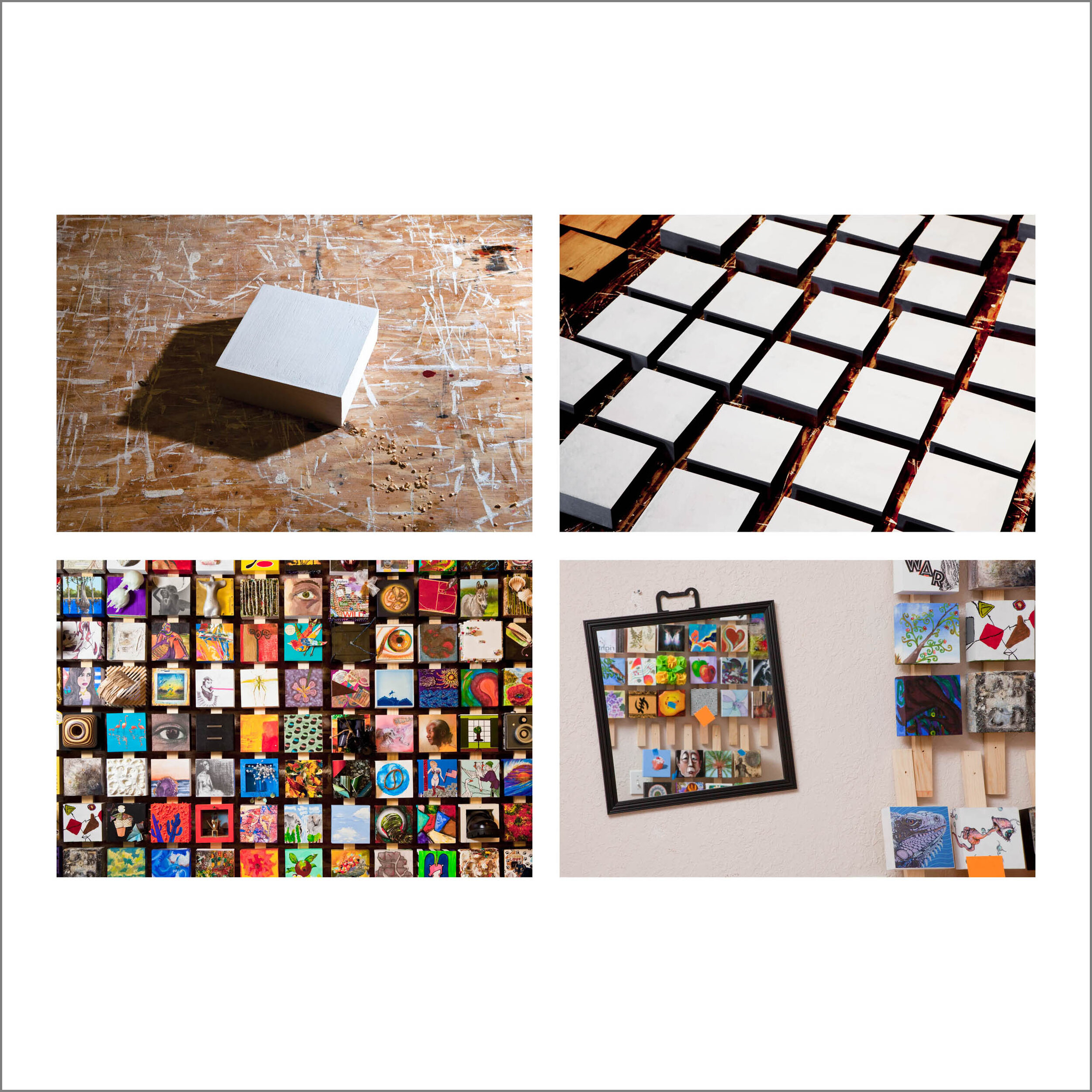
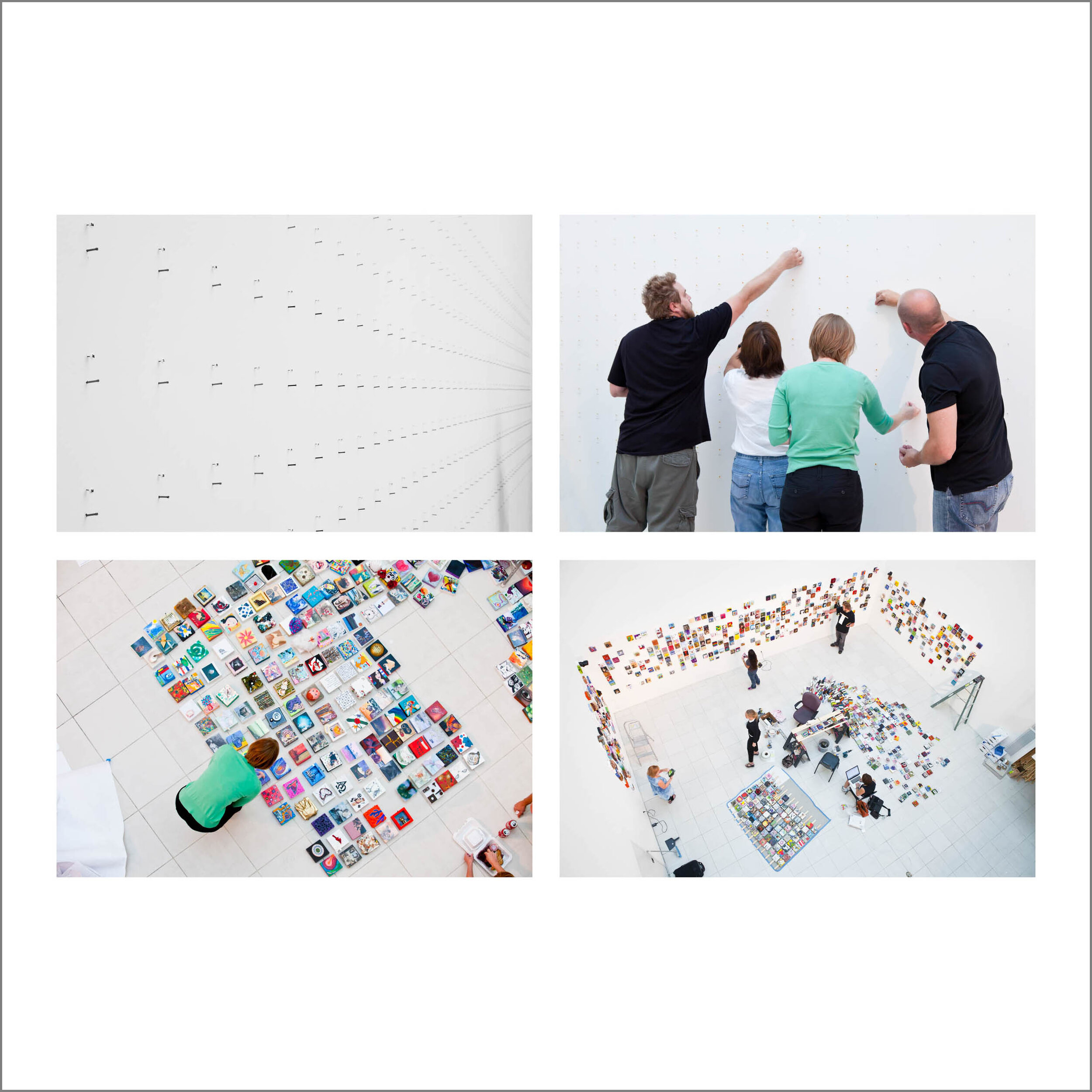
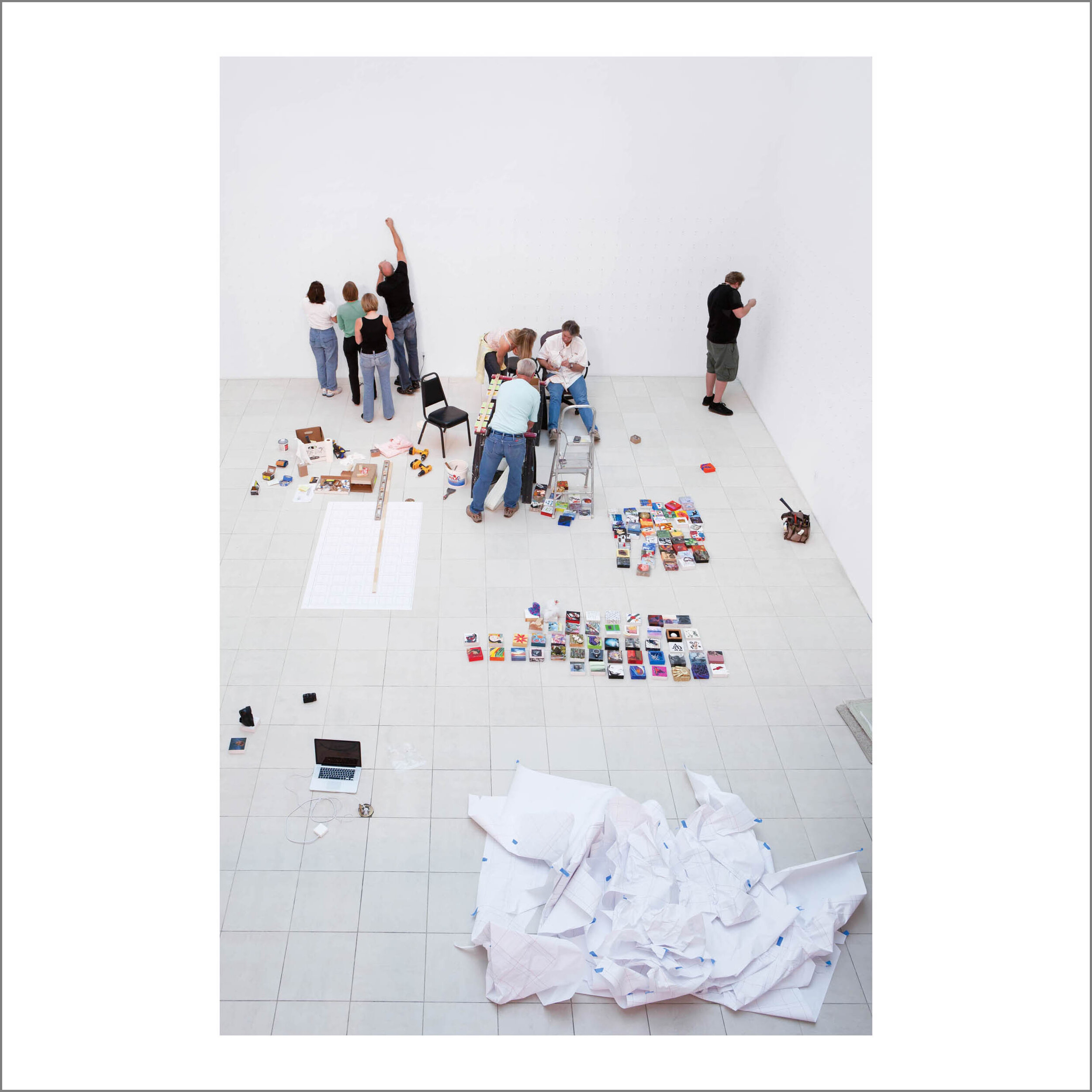
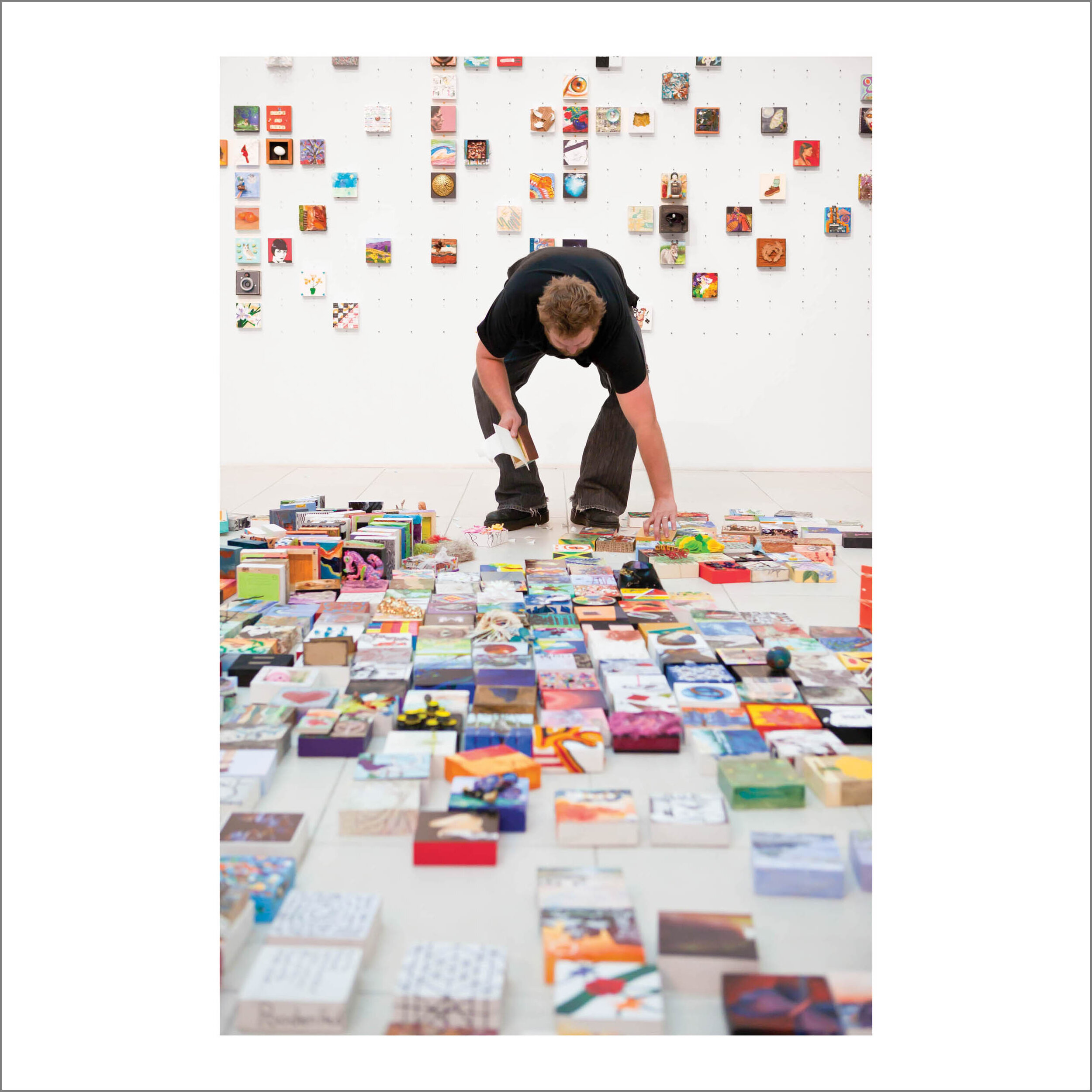
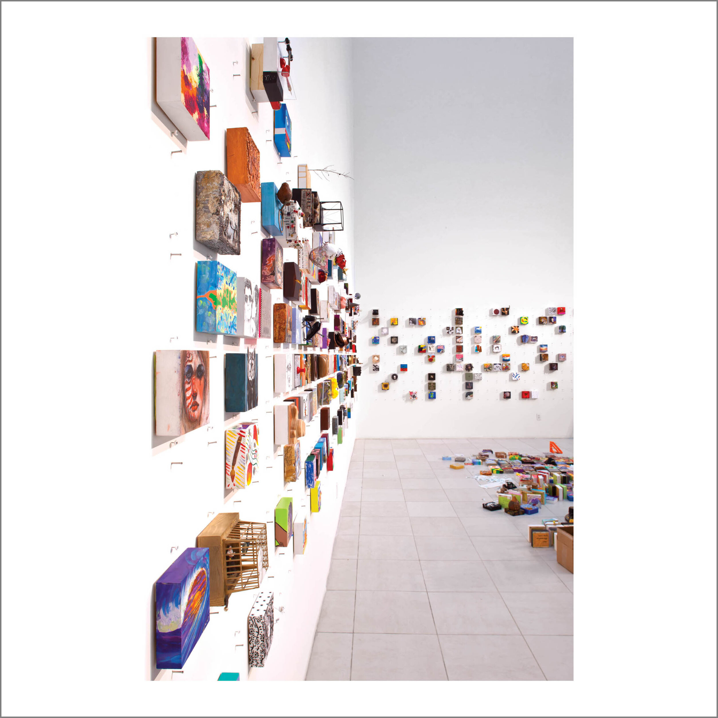
DolfJames_2010-0324_060I just spent the afternoon at the studio of Dolf James, artist, designer, craftsman, and tinkerer extraordinaire, and one of the masterminds of the Imagination Squared project along with Christina Foard. Dolf was busy working on his "squares" for distribution to fellow artists. Find out more about this fascinating "creative response experiment" on their Facebook Page and website. There are over 600 5x5inch wood boxes/squares in the hands of artists throughout the area who are in the process of embellishing it with their own marks. More are being made and distributed, with no planned limit. "I'll keep making them as long as artists are asking for them!" These will be collected and integrated into a single installation - a grid of creativity. If you would like to participate, contact Dolf or Christina through their Fan Page or email at squares@imaginationsquared.com. This is a perfect example of one of the many roles artists must play in the community. To engage, excite, create, and have fun with others. I think the outcome will be more significant that anyone could have imagined. It is probably one of the first projects that is unifying all creatives in our area, bringing together many people for the sole purpose of creation. That's pretty cool!

 The process of making squares...

Making the cut...watch those fingers Dolf!  A little putty to hide the nicks  Sanding

Holes for hanging  Varnish...don't inhale!  Gesso

Gluing the information sheet  Read your instructions!  In the bags they go

Fairytale Fashion by Diana Eng

Diana Eng's Fairy Tale Fashion Collection  FTFash1_bts_2010-0224_010Eyebeam Art and Technology Center in Chelsea, NYCOur daughter Diana has been busy at the Eyebeam Art and Technology Center working on a grant for a project called Fairytale Fashion. It is a program for young girls to explore, design, and make fashions with technology embellishments, combining craft and science into a fun experience. Diana's culmination of the grant was a fashion show in New York Wednesday night where she unveiled 9 new looks, complete with glowing wires, sound sensitive LEDs, inflatable dresses, and deployable structured hoodies. Over 300 were in attendance as the event started up at the Eyebeam Atelier in Chelsea on West 21st Street. The runway was crafted by overhead lights and the music was provided by a eclectic mellow mix by a circuit bending quartet of DJs. I was one of many photographers there capturing a very special moment for Diana at her first runway show in New York.

Fairytale Fashion - under construction  FTFash1_bts_2010-0224_120

Inflatable internals  A surprise feature, LEDs in balloons

A lot goes into putting on a show like this, and we were in New York a day early to help out and do some behind the scenes photography. The final touches were made to the garments in a lab, with as much soldering and chip programming going on as cutting, sewing, and steaming. An interesting mix of craft and technology.

FTFash1_bts_2010-0224_070  FTFash1_bts_2010-0224_089  FTFash1_bts_2010-0224_110

There was hair and makeup to coordinate, final fitting of the models, and of course program debugging on the fly. Another dimension to the usual chaos of a fashion show. For a video of the show go to the Fairytale Fashsion website and the Craftzine blogHere is an article about the show in the June 2010 issue of The Atlantic.

A Steinway is an object of beauty

Steinway_2010-0109_011 Yesterday I was fortunate enough to photograph a restored Steinway piano for a friend. What was supposed to be an hour session turned into a 3.5 hour shoot. I find musical instruments fascinating and I wish that I had even more time to explore some different angles and views with the piano. The instrument was in a corner and I didn't want to move it. Also, next time I need to bring a macro lens and some continuous lights.  I used a 25mm extension tube on my 70-200 zoom for close-ups which is not ideal because of the limited focusing range.

Paul DeauxFinding beauty in all things is an exercise I continuously practice. It is particularly significant when I can find beauty in man-made objects. The fact that this piano is capable of producing beautiful music does in fact suggest that its beauty is inherent, and reflects those who have designed, constructed, and maintained it's form.  This piano was restored by Paul Deaux who is a master craftsman and Steinway specialist. He lovingly removed the keyboard so we could see the individual hammers, and explained how he completely dismantled every piece during the restoration, taking over 600 hours for the process. Amazing.